Designer as User: A Working Vacation Story
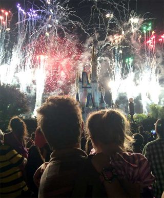
In early September I sat on a panel and gave a presentation at the AIGA Design Educators Conference in Portland, Oregon. In my presentation (and paper) I shared how I’ve found that when designers stop designing and become users themselves, they can develop the reasoning skills that are essential for designing outcomes that connect with people clearly. In order to make this point, I relied on the oldest trick in the book: show vacation photos of your family at Walt Disney World to get the audience on your side.
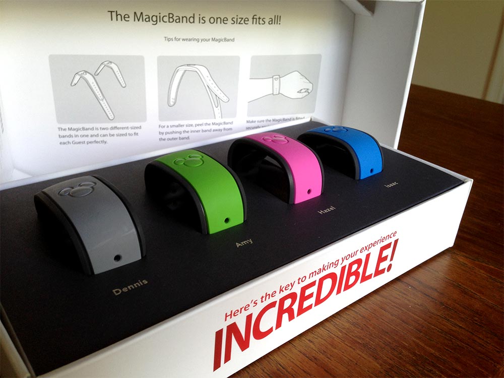
Okay, while I did show photos of rides on Space Mountain, ice creams, and hugs from Goofy, I didn’t do it just to get smiles. The point was how the experience of using Disney’s MagicBand, an RFID-embedded wristband, was a good example of how the user experience forces people to think carefully about why and how they do what they do. MagicBand is provided for all guests who stay at Walt Disney World Resorts and it is used to serve a variety of functions all over the resort. The MagicBand is used as a key for opening guests’ room doors, for purchasing items at stores all over the resort, and for checking in for the ride and attraction reservations.
Operating the MagicBand seems pretty straightforward: tap the debossed “Mickey” on the top of the band to the Mickey Mouse ears symbol located at a room, store, or attraction in order to carry out the function desired. However, each use scenario was unique and came with its own unique challenges. At times the MagicBand was easier to get to work, other times it was a bit more tricky. The task of tapping “Mickey to Mickey” as Disney Cast Members suggested, wasn’t always smooth sailing, but nor were many of the tasks people carry out every day the first time they had to do them.
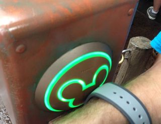
My experience with MagicBand reminded me that using something new requires a person to use trial and error to figure out how it works in different contexts. If my hands were full holding a melting Dole Whip while trying to use MagicBand, it required a bit of finesse to get the angle right to make a successful connection (by the way, you must try a Dole Whip if you get the chance). The times when my family was rushing through queues to get to attractions revealed that using MagicBand while walking quickly produced mixed results. Each use scenario (room, attraction, shopping) came with its own nuances of how to make a successful connection, and practicing using the MagicBand gave my family experience of how it operated. Over the course of our vacation, we became MagicBand experts.
As designers, it’s really easy to take the usage and operation of what we make for granted. Wayfinding, computer interfaces, services, and publication layouts are all examples of design outcomes that must be operated by others. When designers are challenged to become users themselves—to grapple with the untested and unfamiliar—new insights into how to design, the need for collaboration with potential users, and deeper levels of empathizing with those for whom we create, are the lessons learned.
Who knew a family vacation could mean so much?
